Earlier work · NTT DATA

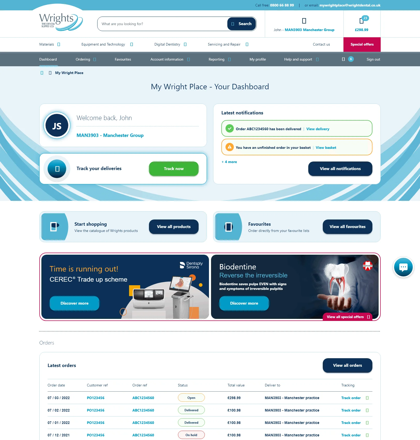
Wrights Dental Portal
Redesigning the online portal dental practices use to order supplies, end to end.
- Role
- User Experience Consultant, NTT DATA Business Solutions (UX lead)
- Duration
- About 4 months
- Team
- Me as the sole UX designer, 2 UI designers and a creative manager
- Client
- Wrights Dental (NTT DATA)
- Platform
- B2B ecommerce portal
- Focus
- Registration, product discovery, baskets, checkout, account management
Discovery
Wrights wanted a complete redesign of the customer portal practices use to buy dental supplies. Feedback said it felt outdated and was hard to navigate, and the internal sales team struggled to use it on phones and tablets while out on the road.
I ran workshops with the sales team to map their current processes and frustrations, and sessions with customers to understand the tasks they did most and the features they wanted.
The challenge
- 01The portal looked outdated and was difficult to navigate.
- 02The internal sales team struggled to use it on phones and tablets, which made them less efficient on the road.
- 03Customers often managed several dental practices in one organisation, which meant multiple baskets, saved baskets and reordering.
- 04Budgets were complex, with different departments buying different items from separate budgets.
- 05Ordering was overly complicated and didn't follow the ecommerce patterns customers expected.
Designing with the build team
The portal was built on an internally developed NTT DATA Business Solutions product, so I worked closely with its development team from the start to understand which components and experiences were feasible.
From there I designed interactive wireframes and tested them with the client and their customers, iterating until sign-off. It was a full site redesign, delivered in sprints, and the biggest project I'd worked on at the time. I stayed with the team through the build to give support and direction.
Account dashboard
A single place to see what's happening across orders, favourites, invoices and support.
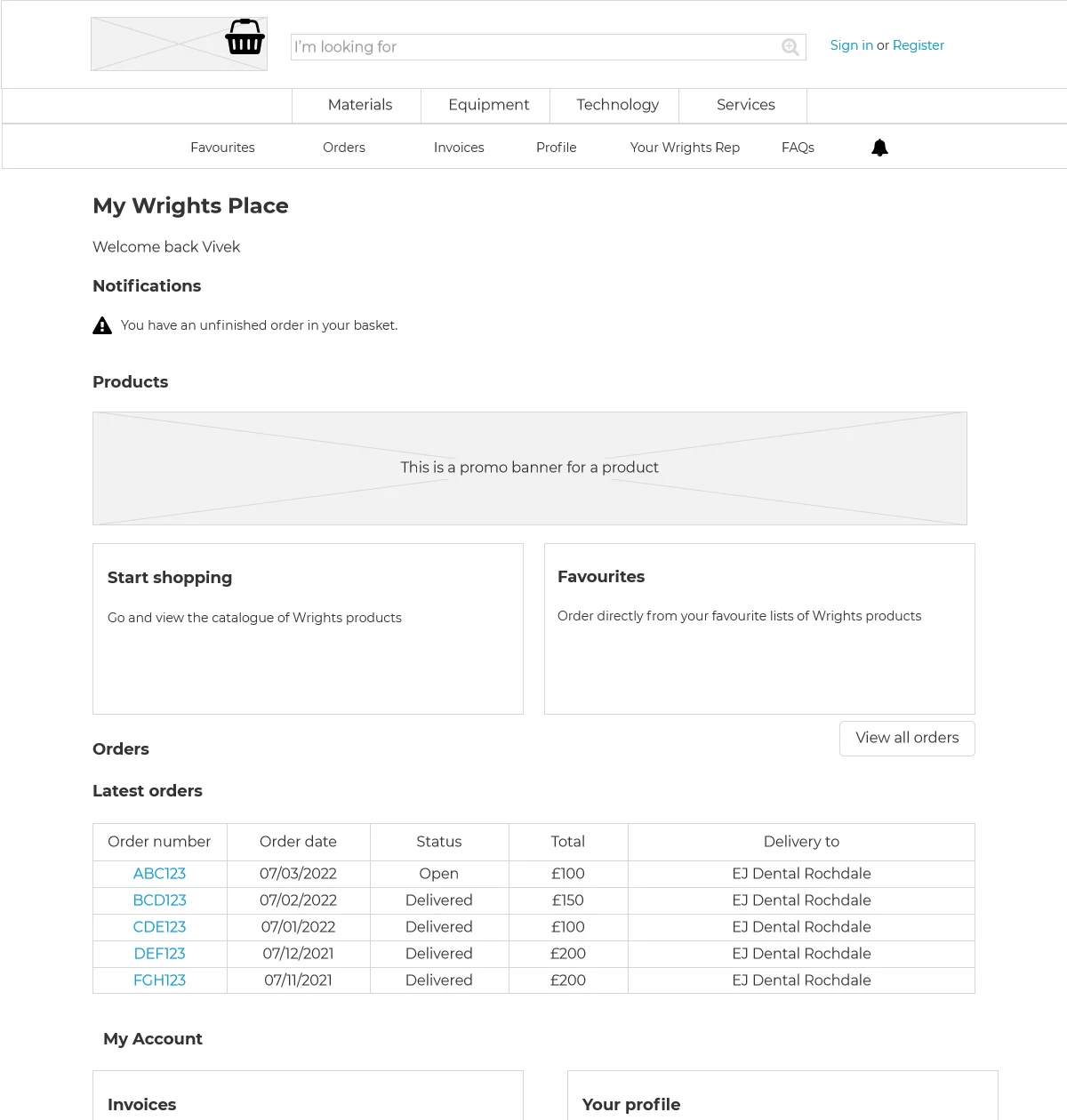
Wireframe: the account dashboard, with orders, favourites, invoices and help in one place.
Final design: notifications, shopping shortcuts, promotions and recent orders.
Multiple baskets and budgets
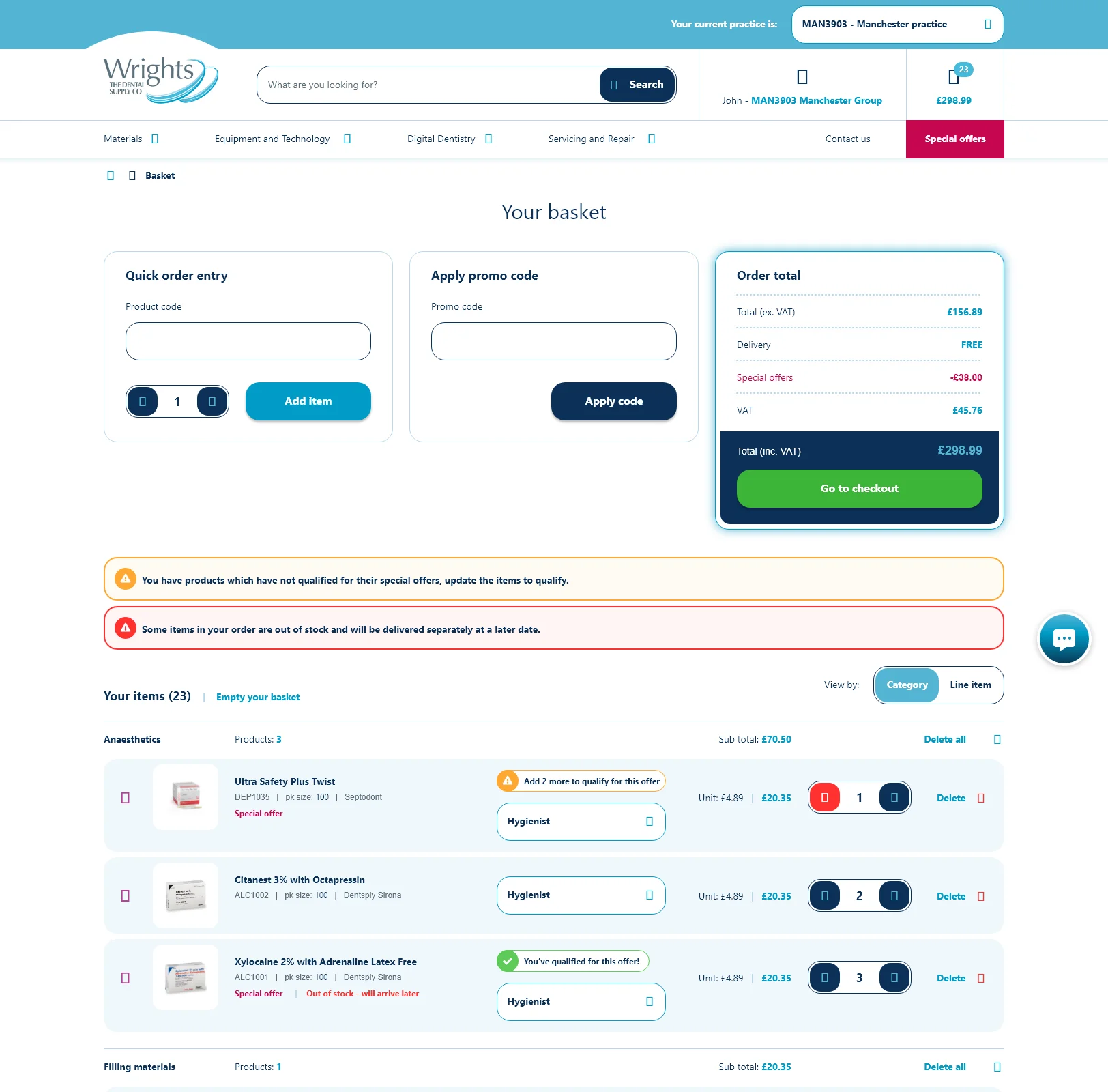
Built around how practices actually order: several baskets, separate budgets and quick reordering.
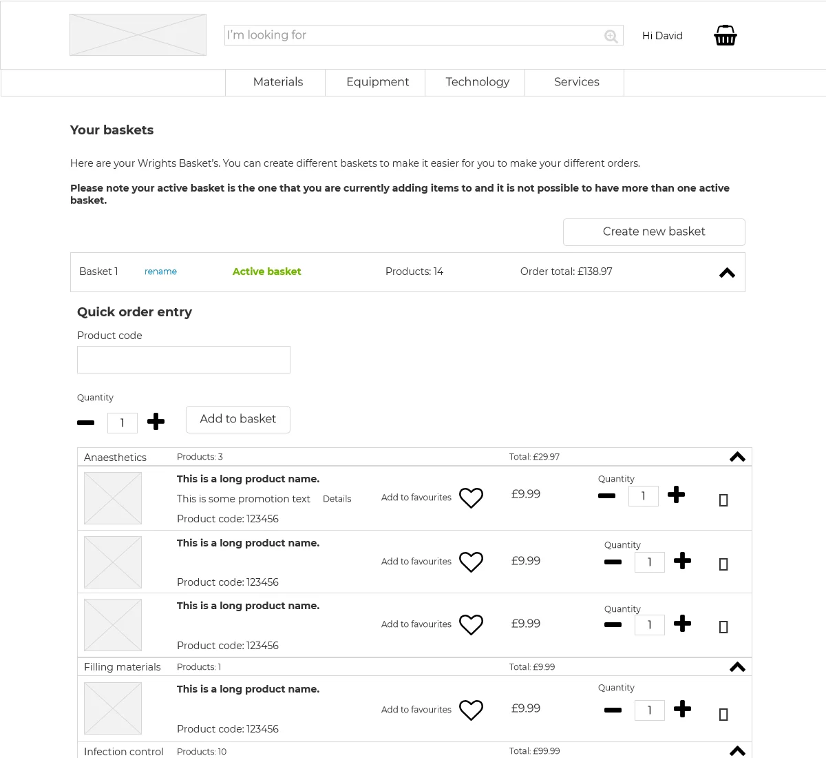
Wireframe: multiple baskets, so each practice or department can order separately.
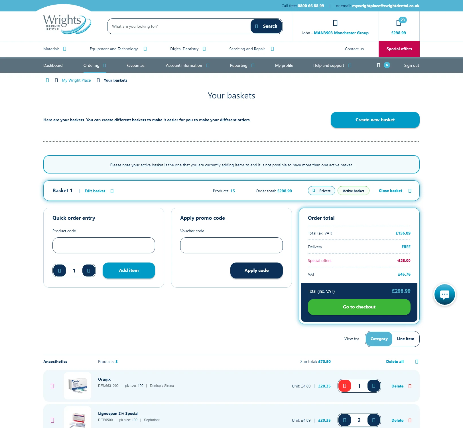
Final design: baskets side by side, with quick order entry and running totals.
Results
- Sales improved across the board, to the point the business had to change its logistics planning to cope with demand.
- Sales team satisfaction increased dramatically, with all agents giving positive feedback on the new portal.
- Customer satisfaction increased, with many customers giving feedback directly to the client.
Like what you see? Let's talk.
Email me at davidedwardsjones@googlemail.com, or get in touch through the contact page.